Candidates Distribution Chart
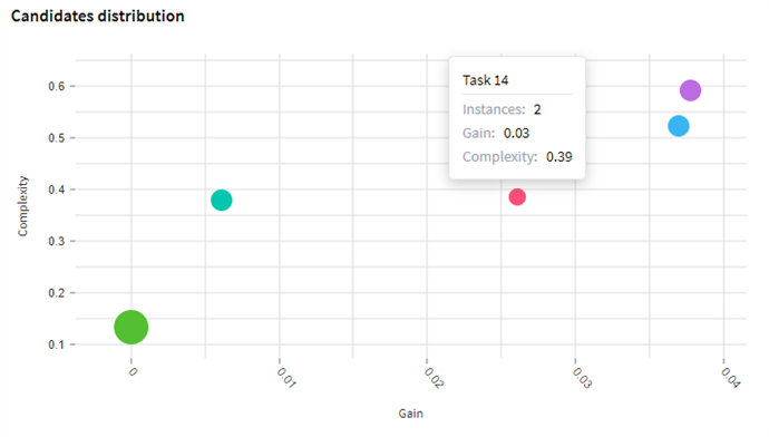
Candidates distribution chart allows to estimate and select the task that benefits most from automation. Each task is presented as a bubble on the chart. Hover over a bubble to see the task name, the number of task instances, gain, and complexity of the task.

Interpreting the Candidates distribution chart:
- Gain axis
Gain is determined by the time required to complete a task. The greater the gain for a task, the more you will benefit from automating it. - Complexity axis
Tasks may have multiple variations, can involve the use of different applications, and contain different numbers of forms. The combination of these factors determines the complexity of a task. - Bubble size
The size of a bubble shows how often the task occurs in the log. The bigger a bubble, the more frequent the task.
Dealing with chart data
After the tasks are defined, the program updates the chart data with the latest information. Review candidates on the chart. Typically, it is recommended to automate frequent tasks with high Gain and low Complexity values, as they will give a greater economy in terms of time and money.
Check the tasks that are presented with the biggest bubbles. These are the most repeatable tasks in logs. You may want to reexamine task definitions for frequent tasks with high complexity. It can be profitable to identify subtasks for them, reorganize task rules, or break the task into several once to create better automation candidates.
05.09.2024 16:23:54