Charts
Overview
Charts is a tool designed to display the content of Metrics and Aggregations in a visual form. They can have different representations - number, line, bar, pie, and combined, making analysis much more illustrative and helping users to get a vision of data distribution in specific cases. You can get a picture of any metric you need with the help of a flexible configuration mechanism, that will guarantee you are working only with the required parts of data. A graphical view makes your work easier and more effective. Add your charts on a Dashboard to get a full-scaled picture of the object of analysis.
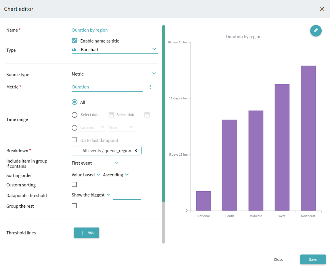
For example, operating a call center, you may want to compare the average time spent to perform a task depending on a region. Make sure to create a Metric with Type - Duration and Aggregator function - Average. Let's name it Duration. Create a Bar chart based on this metric and specify the region attribute in Breakdown. For a better view, select the Value based option in Sorting order. On the chart, you can see the duration value on the Y-axis, and regions on the X-axis. The resulting chart may look as follows:
For instructions on chart creation, see How to Configure Chart.
For general information about displaying charts, see Charts in Analysis Modules and Tools.
9/5/2024 4:23:54 PM