Configuration and Workspace
Configuration
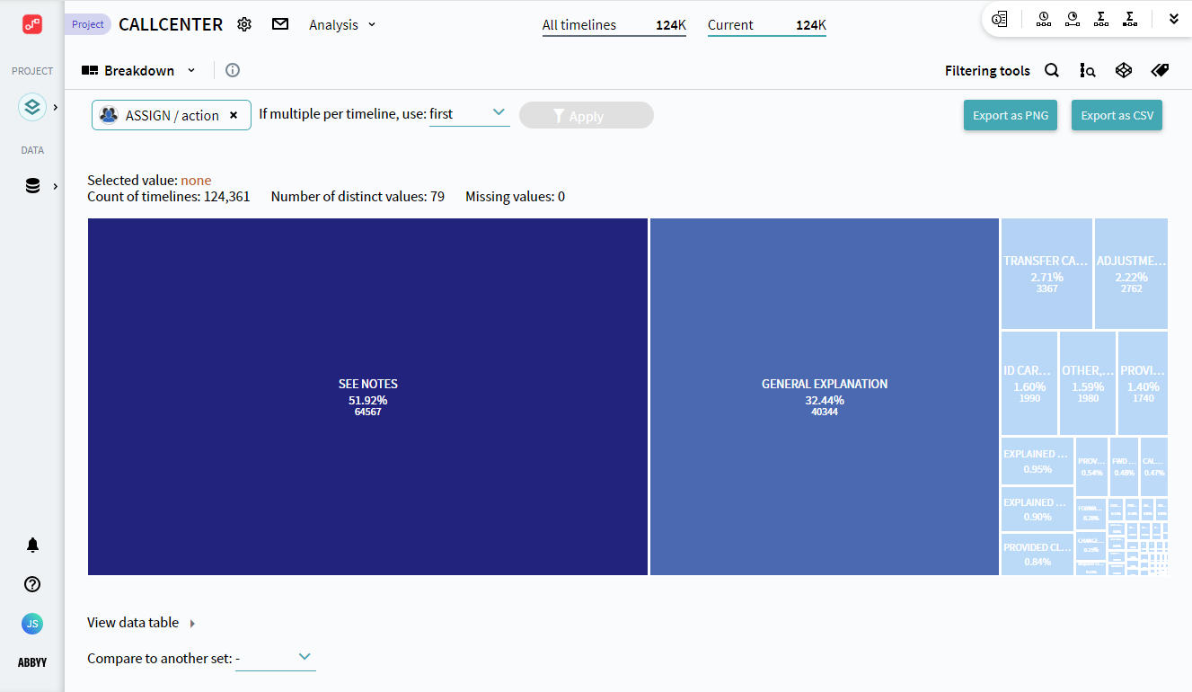
Breakdown is represented by a hierarchy chart with rectangles sized differently. When first opened, the analysis module is empty. You need to determine a dimension by clicking +Select dimensions... and select a pair of an Event (or all events) and an Attribute.
After clicking Select a hierarchy chart will appear:
Events can occur more than once in a timeline, and the Attributes related to them may differ. After the chart is displayed, choose which of the occurrences to use in the breakdown. To do it, select one of the following options in If multiple per timeline, use:
- first
Takes the attributes belonging to the first occurrence of the required event in timelines. - last
Takes the attributes belonging to the last occurrence of the required event in timelines. - per event
Takes the attributes belonging to each occurrence of the required event in timelines.
Workspace
The Breakdown workspace consists of the hierarchy chart itself, a data table, and comparison to another set.
Hierarchy chart
Above the chart is displayed a summary, showing:
- Selected value
You need to click on a pane to select the value it represents. When a value is selected, here you will see its name, the percentage, and the number of timelines in which it occurs. - Count of timelines
The number of currently selected timelines in which the defined Dimension occurs. - Number of distinct values
The number of unique Attribute values belonging to the defined Dimension. - Missing values
The number of rarely occurring attribute values that are not displayed on the chart.
Important. When you work with breakdown analysis, they always show statistics for the currently selected timelines. Pay attention to the filters that select the timelines to explore in the Current block at the top. To learn more, see Effects of Current filters.
The breakdown chart itself consists of rectangles, each representing one Attribute value. The rectangles have different sizes measured according to their frequency, the bigger the rectangle, the more frequent the occurrence of the Attribute value displayed on it.
The rectangles contain:
- The Attribute value name.
- The percentage of timelines in which the Attribute value occurs, where 100% is the number of timelines containing the defined Dimension.
- The number of timelines in which the Attribute value occurs.
- Compared values - the number of timelines containing this Attribute value in the compared set and the ratio of the current set's value to the compared set's value.
Note. The compared information appears only if there is a set selected for comparison. See Compare to another set below.
You can use Attribute values as filters applied to the current set. Select a value by clicking on the corresponding rectangle, and click Apply. After that, an additional filter will be created in the Сurrent pane, which selects timelines by the presence of a specific event/attribute pair in them.
You can save the hierarchy chart to your computer in PNG format to share it with your colleagues or make use of it outside Timeline. To do it, click Export as PNG in the upper-right corner of the window.
Data table
Along with the hierarchy chart, a table with the same data is created. The table display is more focused on numbers and can be exported in the CSV format to share it with your colleagues or make use of it outside Timeline. To do it, click Export as CSV in the upper-right corner of the window.
The table is minimized by default, you can expand it by clicking View data table under the chart. It consists of three columns:
- Dimension name
Contains Attribute values belonging to the dimension. - Count of timelines
Contains the number of currently selected timelines in which the Attribute value occurs. - Percent
Contains the percentage of timelines in which the Attribute value occurs, where 100% is the number of timelines containing the defined Dimension.
Selected Attribute values will be highlighted in the table. Click a table row related to the needed attribute to select it.
Compare to another set
You can select an additional set to compare attribute values' occurrences. To do it, select an existing set in the Compare to another set: list.
Note. The additional sets have to be created and saved in advance. For instructions on how to create a new timeline set, see Timeline Sets.
A bar chart will appear. It is based on a ratio, which is counted by dividing the quantity of attribute values from the current set by the quantity from the compared set. The chart consists of:
- Bars on the X-axis, that represent Attribute values, and are distributed based on ratio, from the highest to the lowest.
- The Y-axis that represents the ratio.
- Bar headers with the general value on the Y-axis, the number of occurrences of the attribute value in the current set/in the compared set. You can hover your mouse over the bars to see more details, including percentages.
9/5/2024 4:23:54 PM