Distribution
Overview
The analysis module is designed to visualize the distribution of numeric values within a process. It allows an overview of any quantitative data in your project by displaying it on a histogram. The calculations are based on dimensions (Event and Attribute pairs), which means that your project needs to have attributes with the data type "number". With the help of Distribution, you can set a specific range of values and filter your timelines by them, which is ideal for focusing on the parts of the process that involve the numeric data of your interest.
To use this analysis module, select Distribution in the drop-down list under the project's name.
Workspace and configuration
The workspace of this analysis module is represented by a configurable histogram, that displays the distribution and counts of numeric attributes belonging to individual events. This is a standard type histogram that appears in many Timeline parts, whose configuration then can be applied as a filter to a timeline set.
To learn more about the histogram display and functionality, see Metric Window.
The Distribution analysis module does not require complex configuration, all you have to do is select an Event and Attribute pair by clicking Select dimension in the upper-right corner of the workspace window. As soon as the dimension is selected, a histogram appears.
Distribution workspace example: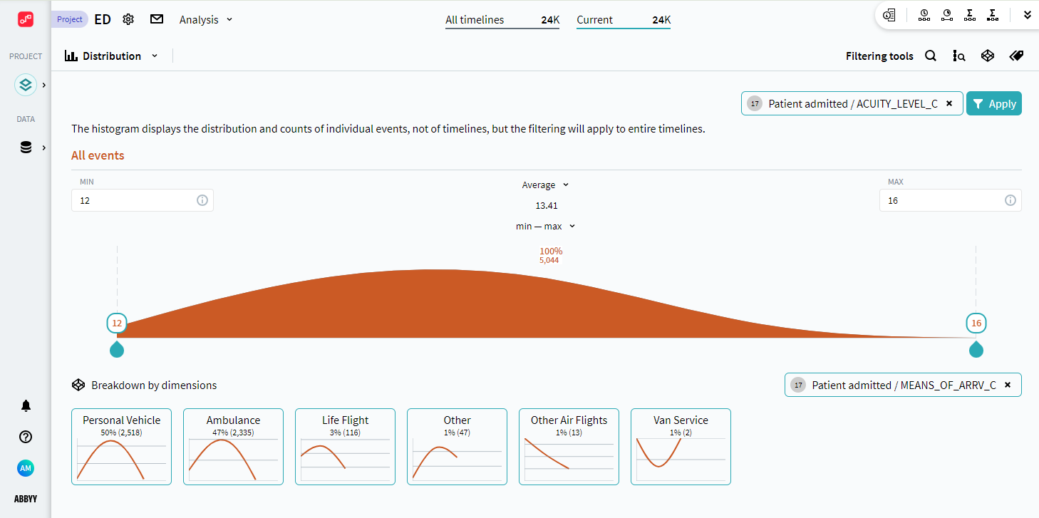
In the context of this analysis module, you may want to take a closer look at the following interactive elements of the histogram:
- Average and Median metric values
These common values are sometimes very useful to have at hand. You can switch between these values at any time, for each of these options its value is always shown below its name. - Histogram boundaries
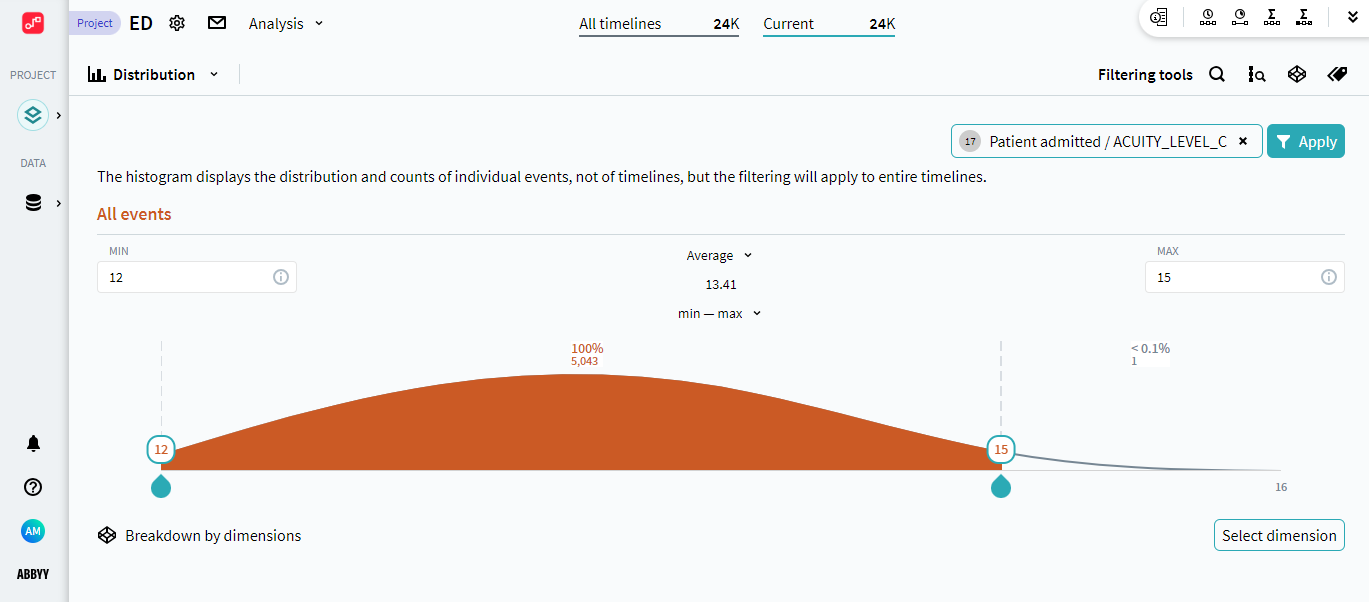
This is the main instrument to focus on a certain range of values, for example, for further filtering. There are two options to define the range of values on the histogram: - Manual adjustment
Move the sliders on the histogram to form a range that contains values of your interest. MIN and MAX numbers change accordingly. - Metric range: min - max, 75 percentile, 90 percentile
Select a suitable option under the average/median value. These are presets for frequency distribution - when you select a range, sliders on the histogram adjust automatically to include the related values.
For details on how the program calculates ranges, see Range Options. - Breakdown by dimensions
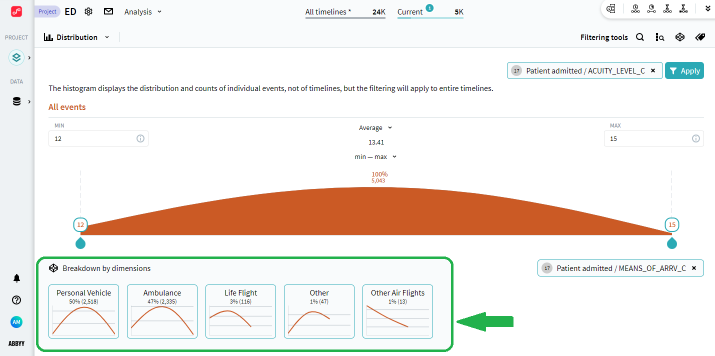
This section offers a simplified functionality of the Breakdown analysis module. Embedded here, it allows taking a look at additional dimensions, related to the one that forms the histogram. Select a dimension to see its distribution for the currently selected timelines in descending order. Click the certain dimension value to display its chart as a main histogram.
Note. Changing borders on the histogram does not influence the dimensional data.
For details on the Breakdown analysis module, see Breakdown.
For more information on the Dimensions tool, see Dimensions.
On the histogram, you receive a distribution overview for the dimension you selected. The resulting configuration can be used as an Attribute value filter. It keeps in your current timeline set only the timelines containing the dimension values that fall into your defined range on the histogram. To create a filter click Apply in the upper-right corner of the workspace window.
Show Distribution analysis example
9/5/2024 4:23:55 PM