English (English)
Candidates Distribution Chart
The CANDIDATES DISTRIBUTION chart helps you assess the complexity of your tasks and determine which of your processes will benefit most from automation. To add a task to the chart, select the checkbox next to the task in the AUTOMATION CANDIDATES table.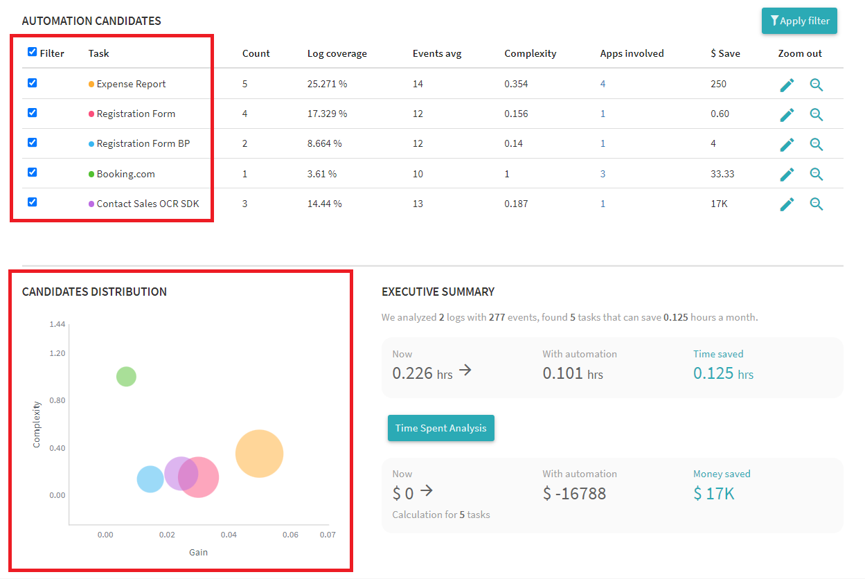
Interpreting the CANDIDATES DISTRIBUTION chart:
- Gain axis
Gain is determined by the time required to complete a task. The greater the gain for a task, the more you will benefit from automating it. - Complexity axis
Tasks may have multiple variations, involve the use of different applications, and contain different numbers of events. The combination of these factors determines the complexity of a task. In the example above, the most complex task is "Booking.com" (the green bubble). - Bubble size
The size of a bubble shows how often the task occurs in the log. The bigger a bubble, the more frequent the task.
Typically, you will want to automate frequent tasks with high Gain and low Complexity values, as they will give the most savings in terms of time and money. In the example above, the most likely automation candidate is "Expense Report" (the amber bubble).
22.09.2023 8:59:47